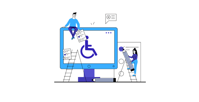
Color blindness accessibility can help us make the web accessible for 350 Million color blind people
Today, about 4.5 percent of the world’s population is color-blind, which equals over 350 million people worldwide. Needless to say, people living with this disability also encounter various forms of challenges when surfing the internet.
Therefore, to help make things a little easier for these people, website owners need to make their websites completely accessible. In this case, implementing color blindness accessibility features will make it more convenient for them to navigate websites.
If you’re in the process of making your website accessible for people living with color blindness, you will need some help, especially if you’re inexperienced. That’s why we have created this checklist for color blindness accessibility. Our checklist aims to tell you everything you need to know to make your site completely accessible for users with color blindness. Let’s get underway.
What is Color Blindness
Color blindness (also described as color vision deficiency) is the inability to see colors the same way others see them. For example, people with color blindness can see pink as gray, blue as purple, yellow as orange or green as brown, and vice versa. We refer to this as red-green color blindness. Also, they are unable to tell how bright colors are or the different shades of colors.
How can you improve Color Blindness Accessibility?
Often, color blindness is hereditary. However, we can somehow influence and manage it by using contact lenses and glasses. Although color blindness is usually mild, severe cases can lead to nystagmus (quick side-to-side eye movement) and light sensitivity.
Checklist for Color Blindness Accessibility
Determining the extent to which your website offers color blindness accessibility to color-blind people is an important factor to consider. This can measure the effect by taking into consideration how color-blind people interact with the web. By deploying assistive technologies, such as software and adaptive technologies that focus on the interaction of color-blinded and the website.
Thus, the outlined accessibility checklist for color blindness provides web accessibility solutions for those with color blindness. They include:
1. Use of Screen Readers
The use of screen readers can assist color-blind people in retrieving the same information on the internet. Here, texts are usually converted into synthesized speech, after which they can then be used by merely touching the screen. With screen readers, color-blind people can comfortably use the computer, gain access to apps, documents, and so on.
Color blindness accessibility can be achieved with screen readers, color-blind individuals can scan through web pages and read texts out loud. Therefore, we encourage web owners to design websites with the following features.
2. Alternative Text Description
Rather than have content in text form, other non-text content descriptions such as graphics and images can be used. Without this alternative being provided, I will not fully grasp the page’s content in its entirety. This is because screen readers skip through images and graphics when moving through the page.
3. Descriptive Page Headings
Descriptive page headings announce the headings of the document to be viewed using the backend. This is usually done while the page is still loading. Hence it helps people with colorblindness make a quick decision on whether the content is worth reading. Color blindness accessibility and in fact, It’s a time-saving feature and of immense benefit to those with colorblindness.
4. Use of Heading
Without going through the content line by line, some screen readers can skim the page content, giving you an overview of what it’s about. However, we may achieve this only with pages that have headings.
5. Color and Brightness: 4.5:1
Color and brightness do not only affect color-blind people but every person with vision impairments. to reach color blindness accessibility make sure that your color and brightness ratio is following accessible levels. Thus you must ensure that the contrast ratio between background and text is at least 4.5:1.
What does this mean?
If the background is a solid color, such as all black or all white, the relative color of the text can be controlled. In fact, ensuring that the contrast ratio of both the text and the background is 4.5:1. For instance, some require low brightness for text and background, while others require a high brightness (the latter is often age-related). Also, some prefer black texts on white backgrounds. This can help compliance with Color blindness accessibility.
If the text or the background differ, or there is a pattern in relative colors, then you can select or shadow the background around the letters. To give an example, if a letter is lighter at the top than it is at the bottom, the contrast ratio between the top and bottom of the letter and the context over the entire letter can be difficult to maintain. In this case, the designer might want to make the background darker behind the letter.
Another option is to add a thin black outline (minimum one pixel wide) around the letters. This will add contrast and improve the readability. Hence we enhance readability, when the recommended color contrast ratio for background and text adopts. Color blindness accessibility will benefit from added textures and patterns as this will help differentiate between data points when making graphic representations.
6. Easy to Read Fonts
Fonts are readily available in various families and types. However, some are more readable than others. For easy access by color-blind people, make text sizes more adjustable on web browsers. Modify the text size, font, shape and way a text to present accordingly, so you may achieve ultimate color blindness accessibility.
To further aid color blindness accessibility, we add name descriptions to the font; this will assist users when using the web.
7. Navigation of Keyboard
Most computers and laptops feature a mouse for ease of use, but while this can be the case for people without dissabilities, it’s not so for color-blind persons. This is because using a mouse requires a lot of attention beforehand so eye coordination can be maintained. A situation that can be more difficult for those with nystagmus.
But with commands and shortcuts, individuals suffering from colorblindness are better able to navigate the web. Many browsers are already adopting this with their in-built keyboard function that helps users perform various online tasks.
8. Line and Text Spacing
It is important to have lines and words separated as this will increase the readability of web content. Include also between lines of a block of texts, words, and letters. Also, web content features adjustable text spacing options that will further enhance readability.
Furthermore, include justification and alignment options; this eliminates user distractions when creating content. All of these are of great benefit to color-blind people.
9. Clear Labels and Links
Color-blind individuals can be benefit greatly when distinct labels and links feature on websites. However, such links and labels should be as clear and precise as possible. For instance, using link labels such as ‘click here’ isn’t clear enough and can be challenging to understand, especially using screen readers. Therefor you will not reach color blindness accessibility.
The best practice will be to use a keyboard shortcut in listing all available links on a page; this will make it easy to navigate and distinguish link labels out of context. Therefore, distinctive texts should surround links in order to succeed color blindness accessibility. This will not only enhance color web accessibility; it will also promote the website’s search engine optimization (SEO).
Also, rather than use font color or weight to denote links, underlining the link is a preferable option. This is because color fonts and weights have a low contrast ratio, a situation that makes it difficult for those with colorblindness to distinguish between anchor text and text. Hence, to avoid this, it’s best to underline the links; this immediately indicates an anchor text from a regular text.
10. Color Normalization
While using colors in interfaces, web developers must ensure it’s in line with WCAG guidelines on background and text ratio. Doing this will promote easy visual accessibility of web pages and as a result reach color blindness accessibility.
Deploy links and other information that requires a response, action point, or great importance using the right color representation. However, colors are not the only means of passing information and reaching color blindness accessibility; this is particularly true for people with low vision.
In cases such as this, use, warnings, alerts, buttons, and textual links, in addition to color to enhance readability. Also, infusing visual hints such as placement and size may help. Thus, it’s important to choose colors of high contrast ratio; this will make it easy to interpreter charts.
When designing web content, some colors should be avoided whenever possible as they aren’t ideal for those with colorblindness owing to their difficulty in differentiating between them.
Examples of such colors are green-red, green-brown, light green-yellow, green-black, green-blue, green-grey, and blue-purple.
Other tips to note include:
- Use textures and patterns; this will make it easier for users to different one segment from the other
- Include text labels to segments for ease of understanding.
Final Thoughts Checklist Color Blindness Accessibility
These days, it’s important to have a checklist for color-blind people as these sets of people also use the internet and deserve to do so with ease. Their online activities include online shopping, seeking entertainment, work research, scheduling appointments, and so on. When websites are not accessible to them, they either keep searching for the ones that are color blindness accessible or file a lawsuit against web owners for web accessibility.
Therefore, websites must be developed so that they are made perceivable, understandable, operable, and robust. Without this, website owners will be cutting themselves off from the profit made by over 350 million people.
Asides from the color blindness accessibility checklist, there are also others such as the accessibility checklist for auditory disabilities that web owners can explore. If this is taken as seriously as it should, then we would have a world of equal rights and opportunities for all.
Want to know if your website is in full compliance with accessibility guidelines? You can use eCheckers such as AccessiBe Accessibility Checker. It’s one of the most reliable checkers around.