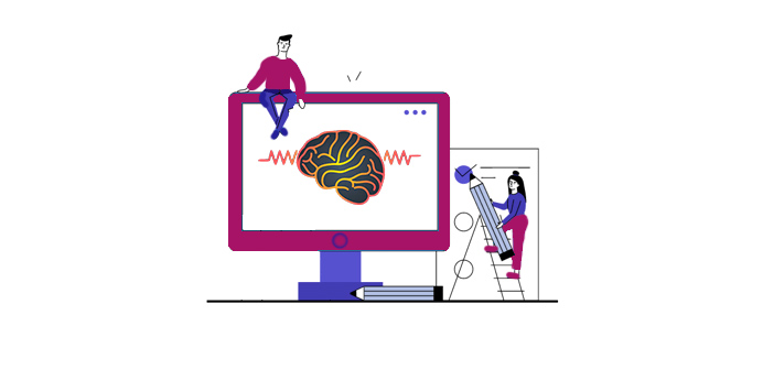
Do you know about all of the different website design options out there? There’s such a variety of sites available that it can be overwhelming to find the right one for your business. But there’s one thing that all website owners need to consider: accessibility. What is considered a good or a bad accessible web design in 2021?
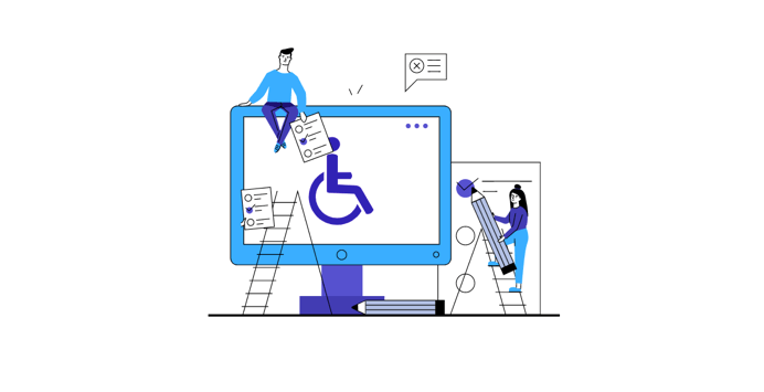
Accessibility is the practice of making a website usable by everyone. While accessibility is often overlooked, it’s a vital part of maintaining a successful website. After all, a website accessible to everyone will get more views than a site that isn’t.
There are many different aspects of accessibility that must be considered when designing a website. One of the most important aspects to consider is the content on the website. Using the correct coding and design techniques can make a website easy to navigate for anyone, even those with disabilities.
The Web Content Accessibility Guidelines (WCAG) are a series of standards that website developers should follow to make their website more accessible to all people — not just people with disabilities. There are three levels of accessibility: A, AA, and AAA (AAA is the highest level). In this article, we won’t go in-depth about the levels of accessibility but will instead focus on the bad practices to avoid and the good ones to follow. In the end, we will go through the best tips to improve your website design and make it more accessible.
What is a Bad Accessible Web Design?
A bad accessible web design doesn’t have enough contrast, and therefore, the text isn’t easy to read. In the countless pages of the internet, you’ll find a large number of websites that haven’t even implemented any accessibility at all. It’s highly likely that their owners still don’t know what web accessibility is. But there are many ways to make a website inaccessible. Here are a few examples of bad website design practices to avoid:
- Using flashes
- Not using any color contrast
- Using images as links
- Not using alt text
- Using underlined text
- Not using captions
- Using a web font that is not easy to read
- Not having a clear heading hierarchy
- Using only visual design elements without providing any text
- Not providing any accessible content at all
- Using a fixed font size that is too small to read
- Using too many colors
Bad designs can be frustrating for everyone, but they can be especially frustrating for people with disabilities. For example, a blind user may have a web reader that reads the page’s content to them. If the content has ads or videos that aren’t coded correctly, the web reader won’t read the content.
What is a Good Accessible Web Design?
Another great way to make it more accessible is by adding a text background color for extra contrast. That is needed whenever you see a variety of colors similar to the ones in your text. Everyone can use a good accessible design. It follows universal design principles, creating products that are usable by people of all ages, abilities, and disabilities.
A good accessible design is also one that takes into account the testing of the user interface. This means that the design is tested and evaluated for color contrast, font size, and any other elements that could interfere with the website’s usability.
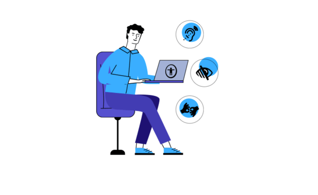
But what makes a good accessible design stand out? It’s the details. For instance, a good accessible website will offer alternative text descriptions for all images. It will also offer alternative navigation options for users using screen readers, which are software programs that allow users to hear the text on the screen.
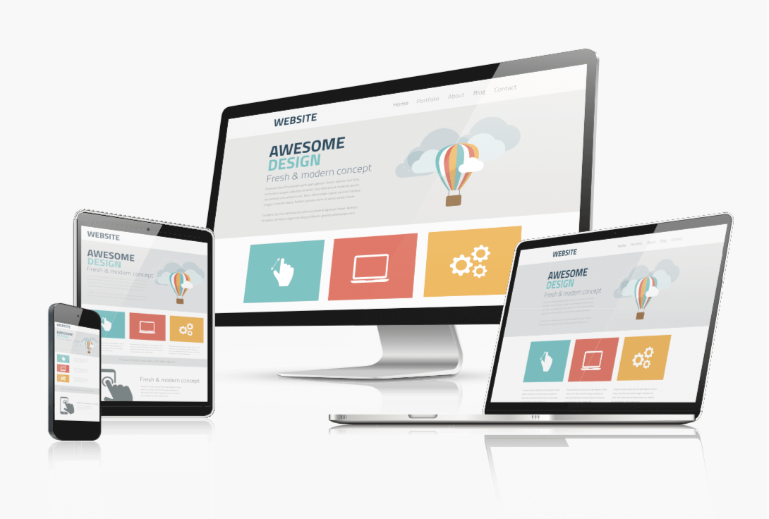
Another good example is a good accessible design that offers a high level of flexibility. This means that the design will work well in a variety of screen sizes. This is important because many users are viewing the website on different devices, which use different resolutions.
How to Make it Better?
Even though we’ve covered plenty of different tips to improve your website’s accessibility, we decided to take our time and focus on the best ones once again. Let’s jump straight into the first one.
Contrast & Colors
Contrast, contrast, and contrast! Yes, it’s that important, and people tend to forget that it exists sometimes. Your website must have enough contrast and make all the text easy to read. Next, keep in mind the variety of colors. If your website looks like a rainbow, it might bring discomfort to your visitors, who might stay for a longer period.
Label Forms & Provide Feedback for Errors
There are so many websites that don’t have any labels for their forms. Screen readers can’t go through the forms if you haven’t labeled the forms correctly. It’s even worse to put some random text on the forms. Also, as we’re talking about forms, make sure to provide feedback to your users for their errors. The most common feedback we see is the one about password strength: “Your password must be longer than eight symbols and contain….”
Simple Navigation and Keyboard Navigation
This is a key feature of any website. Make your navigation bar easy to use and keep it fixed on all your website’s pages. That way, it will be impossible for your visitors to get lost on the different pages. Also, make sure that users with disabilities can navigate through your website only with their keyboards.
Proper Headings Hierarchy
You should make good use of h1, h2, h3, etc. Your headings should also have the proper text and tell the user exactly what to expect in the following paragraphs. You can’t have a heading about a game and talk about a movie.
Responsible Design
Even though the responsible design is already used for most websites, we decided to look at it as many sites fall apart when you open it on a mobile device. When creating the design, focus on percentages rather than exact pixels.
Use both Text and Videos
If you plan on embedding a video in your website, make sure to put captions on the video or explain it using text, either above or below the video. Your content must be accessible to people with any disability.
Conclusion
Making a website fully compliant manually can be a hard thing to do as there are many requirements. While implementing some of the accessibility policies, you may remove others by mistake. That’s precisely the reason many people turn to the automated compliance checkers that apply the guidelines. It could be done in a few days, and you won’t be doing anything apart from starting the process.
But with enough dedication and time, you can make your website fully compliant. If you follow the WCAG correctly, your website will look perfect in any aspect. Overall a compliant website is easy to use and could be used by everyone, whether they have aging problems or disabilities.